纯CSS3水滴元素动画特效实例免费下载
CSS3实例 次 2019-04-22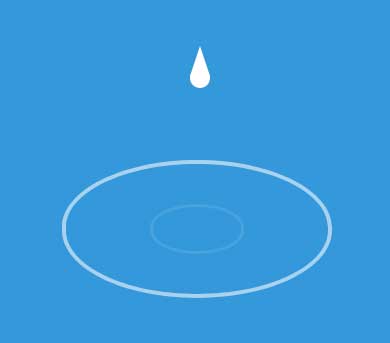
纯CSS3实现水滴元素动画特效,无需JavaScript即可打造灵动水滴效果。巧妙运用样式与动画设计,为网页注入鲜活细节,增强视觉吸引力。简洁高效,轻松提升用户体验,是网页美化的理想之选。

css3 animation属性绘制水滴落下波纹动画,网页水滴元素动画特效。
[声明] 墨鱼部落格所有资源为用户免费分享产生,若发现您的权利被侵害,请点击后方链接查看并联系我们,我们尽快处理。免责声明|侵权处理流程
使用方法:
1、head引入css文件
<style>
body {
  background-color: #3498DB;
  overflow: hidden;
}

div {
  margin: 175px auto;
}

.drop {
  position: relative;
	width: 20px;
	height: 20px;
  top: -30px;
  margin: 0 auto;
	background: #FFF;
	-moz-border-radius: 20px;
	-webkit-border-radius: 20px;
	border-radius: 20px;
  -moz-animation-name: drip;
  -webkit-animation-name: drip;
  animation-name: drip;
  -moz-animation-timing-function: cubic-bezier(1,0,.91,.19);
  -webkit-animation-timing-function: cubic-bezier(1,0,.91,.19);
  animation-timing-function: cubic-bezier(1,0,.91,.19);
  -moz-animation-duration: 2s;
  -webkit-animation-duration: 2s;
  animation-duration: 2s;
  -moz-animation-iteration-count: infinite;
  -webkit-animation-iteration-count: infinite;
  animation-iteration-count: infinite;
}

.drop:before {
  content: "";
  position: absolute;
  width: 0;
	height: 0;
	border-left: 10px solid transparent;
	border-right: 10px solid transparent;
	border-bottom: 30px solid rgba(255,255,255,1);
  top: -22px;
}

.wave {
  position: relative;
  opacity: 0;
  top: 0;
	width: 2px;
	height: 1px;
  border: #FFF 7px solid;
	-moz-border-radius: 300px / 150px;
	-webkit-border-radius: 300px / 150px;
	border-radius: 300px / 150px;
  -moz-animation-name: ripple;
  -webkit-animation-name: ripple;
  animation-name: ripple;
  -moz-animation-delay: 2s;
  -webkit-animation-delay: 2s;
  animation-delay: 2s;
  -moz-animation-duration: 2s;
  -webkit-animation-duration: 2s;
  animation-duration: 2s;
  -moz-animation-iteration-count: infinite;
  -webkit-animation-iteration-count: infinite;
  animation-iteration-count: infinite;
}

.wave:after {
  content: "";
  position: absolute;
  opacity: 0;
  top: -5px;
  left: -5px;
	width: 2px;
	height: 1px;
  border: #FFF 5px solid;
	-moz-border-radius: 300px / 150px;
	-webkit-border-radius: 300px / 150px;
	border-radius: 300px / 150px;
  -moz-animation-name: ripple-2;
  -webkit-animation-name: ripple-2;
  animation-name: ripple-2;
  -moz-animation-duration: 2s;
  -webkit-animation-duration: 2s;
  animation-duration: 2s;
  -moz-animation-iteration-count: infinite;
  -webkit-animation-iteration-count: infinite;
  animation-iteration-count: infinite;
}

@keyframes ripple {
    from {
      opacity: 1;
    }
    to {
      width: 600px;
      height: 300px;
      border-width: 1px;
      top: -100px;
      opacity: 0;
    }
}

@keyframes ripple-2 {
    0% {
      opacity: 1;
    }
    50% {
      opacity: 0;
    }
  100% {
    width: 200px;
    height: 100px;
    border-width: 1px;
    top: 100px;
    left: 200px;
  }
}

@keyframes drip {
    to {
      top: 190px;
    }
}
</style>
2、body引入HTML代码
<div class="drop"></div>
<div class="wave"></div>
文件目录
本资源来自:代码 » CSS3实例 » 纯CSS3水滴元素动画特效实例免费下载
注:此资源非帝国CMS模板/特效/源码,需要帝国CMS整站模板源码的小伙伴,请移步 帝国CMS模板,感谢支持!
CSS3爱心雨动画特效实例免费下载
« 上一篇 2019年04月13日
10种CSS3鼠标悬停图片特效实例免费下载
下一篇 » 2019年04月11日
1、如非特殊说明,本站对本文提供的代码或者素材不拥有任何权利,其版权归原著者拥有。
2、以上提供的代码或者素材均为作者提供和网友推荐收集整理而来,仅供学习和研究使用。
3、如有侵犯你版权的,请来信(邮箱:48444431@qq.com)指出,核实后,本站将立即改正。
4、如有链接无法下载、失效或广告,请点击下面的报错或者联系墨鱼处理!
5、以上资源售价只是赞助,不代表代码或者素材本身价格。收取费用仅维持本站的服务器开销!
6、如无特殊说明,如:织梦或者帝国等开源CMS核心模板,那么默认提供的只是HTML模板!
7、所有代码素材效果均为演示打包,最终效果请参考演示效果,本站不提供任何技术支持和服务。
8、代码素材均为虚拟物品,演示和描述无错的情况下,无法进行退换服务。
2、以上提供的代码或者素材均为作者提供和网友推荐收集整理而来,仅供学习和研究使用。
3、如有侵犯你版权的,请来信(邮箱:48444431@qq.com)指出,核实后,本站将立即改正。
4、如有链接无法下载、失效或广告,请点击下面的报错或者联系墨鱼处理!
5、以上资源售价只是赞助,不代表代码或者素材本身价格。收取费用仅维持本站的服务器开销!
6、如无特殊说明,如:织梦或者帝国等开源CMS核心模板,那么默认提供的只是HTML模板!
7、所有代码素材效果均为演示打包,最终效果请参考演示效果,本站不提供任何技术支持和服务。
8、代码素材均为虚拟物品,演示和描述无错的情况下,无法进行退换服务。

